I have been having some difficulty deciding what the appearance of this blog’s home page would look like. I did some experiments and played around with the arrangement of elements to try to find the best solution, and I think I managed it.
I wanted to use the cute templates usually made for Notion as inspiration for the layout, but they generally involve many images and I didn’t want to use too many decorative images. Besides, my initial idea of the left side being only for news and the right side being merely decorative with calendars, clocks, GIFs, etc., seemed a bit dull, especially after taking the sketch from paper and putting it into Figma.
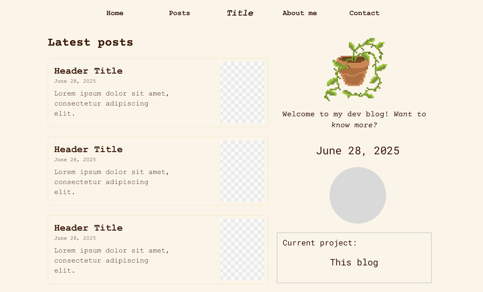
However, I noticed that the web and mobile versions were drifting apart in terms of element placement, and I decided to try to make the web version look a bit more like the mobile one, meaning: placing the GIF and the welcome text occupying the entire top, a page “divider” containing the project I am currently working on underneath, and the latest posts following that division. This way, since I intend to use Bootstrap, it is simpler to use columns without having to create more than one element and hide them on different screens. In addition, I included a section to show other projects right on the home page, which will sit next to the latest posts, and on mobile will naturally sit underneath.
I think that, considering the objectives and the simplicity of this blog, I don’t need to do anything much more extravagant and this is already good for the home page. I will move on to the other pages and, if more ideas come up later on, I can always modify this design.